Framer + Shopify Component
Documentation
Framer + Shopify Component
Documentation
How to use the components within this template
Main "Shopify" Component

This is the main Shopify data component, and needs to be on every page that will be pulling Shopify data. By default this template has this component in the top NavBar, and is thus included on every page. You need to configure this component with your Shopify Store URL and a Shopify Storefront Access Token for your store. Obtain one by the following:
1. Start by logging into Shopify and accessing the Apps menu. Proceed to App and sales channel settings.
2. Find the Develop apps tab where you should select the 'Create an app' option.
3. Pick a name for your application (it can be anything), and press Create app.
4. Select 'Configure Storefront API scopes' and ensure the following scopes are selected before saving:
- unauthenticated_write_checkouts
- unauthenticated_read_checkouts
- unauthenticated_read_content
- unauthenticated_read_product_listings
- unauthenticated_read_product_inventory
- unauthenticated_read_product_tags
5. At the top right of the screen, click on the Install app button.
6. Finally, go to the API credentials tab to copy your API access token.
See https://shopify.dev/docs/custom-storefronts/building-with-the-storefront-api/getting-started#step-1-enable-storefront-api-access for more info.


ShopifyProducts
ShopifyProducts
ShopifyProducts
Dynamically pull all products from Shopify and display them in a paginated grid. You can set the "Category" field to pull only products from a specific category if they are configured in your Shopify store backend. Various display parameters can be set in the Framer configuration panel
Dynamically pull all products from Shopify and display them in a paginated grid. You can set the "Category" field to pull only products from a specific category if they are configured in your Shopify store backend. Various display parameters can be set in the Framer configuration panel
DynamicOverrides
DynamicOverrides
DynamicOverrides
Framer + Shopify includes code overrides for common Shopify product data like title, description, and price. Style your text however you want, and dynamically replace with data from Shopify.
Framer + Shopify includes code overrides for common Shopify product data like title, description, and price. Style your text however you want, and dynamically replace with data from Shopify.
ShopifyProductProvider
ShopifyProductProvider
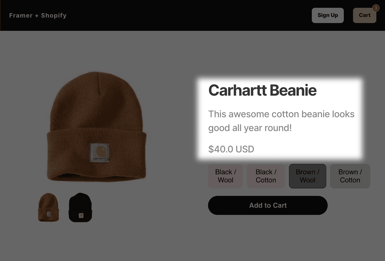
This component provides data about a single product. Put it on your product pages (see /beanie and /product for examples), or any page that needs to have access to Shopify data for a single product (components like ShopifyProductTitle, ShopifyProductDescription, and ShopifyPrice).
Leave the "Shopify Product Handle" value empty on this component if you want the page it's on to pull data for the product name given in the ?product=… URL parameter (set by ShopifyProducts and ShopifyProductCard components if "Add ?handle=... to Product Page URL" is enabled).
You'll notice that /beanie has this component's "Shopify Product Handle" value set to carhartt-beanie. This means that the /beanie page will always pull data from Shopify for the carhartt-beanie, regardless if there's a ?product= URL parameter or not.

ShopifyProductTitle, ShopifyProductDescription, and ShopifyPrice
These components provide the title, description, and price for a single product. Must be used on a page that contains an instance of the ShopifyProductProvider.
These components provide the title, description, and price for a single product. Must be used on a page that contains an instance of the ShopifyProductProvider.

ShopifyVariants
ShopifyVariants
Allow your users to select product variants defined in Shopify. Must be used on a page that contains an instance of the ShopifyProductProvider.
Allow your users to select product variants defined in Shopify. Must be used on a page that contains an instance of the ShopifyProductProvider.
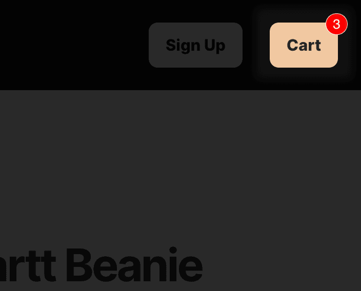
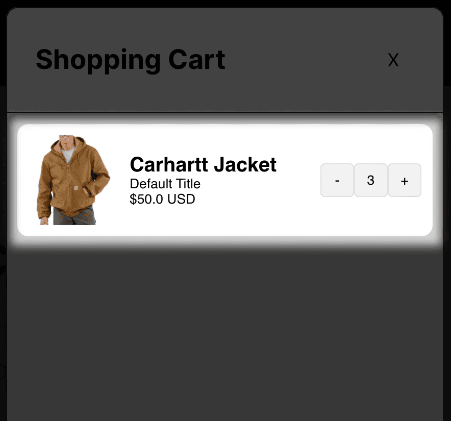
ShopifyCartCount
This component provides a counter of the number of items in the user's cart. This component can be positioned next to just about any cart button, so you can design your cart button as you wish. Just make sure your cart button triggers a Tap link event that your ShopifyCartOverlay instance (described below) is triggered to show on.
This component provides a counter of the number of items in the user's cart. This component can be positioned next to just about any cart button, so you can design your cart button as you wish. Just make sure your cart button triggers a Tap link event that your ShopifyCartOverlay instance (described below) is triggered to show on.